Cortney
Star
 [AWD:0c15]The Objectioner
The Bown
[AWD:0c15]The Objectioner
The Bown
Posts: 885
|
Post by Cortney on Jun 12, 2010 12:24:15 GMT -5
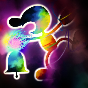
The moon is missing a chunk in the top right corner, but other than that I like it.
|
|
Matthew
Planet
[AWD:02030716]
Blah
Posts: 471
|
Post by Matthew on Jun 12, 2010 12:24:36 GMT -5
I like it more with the glow |
|
|
|
Post by Breepop on Jun 12, 2010 12:28:52 GMT -5
More glow than that, less glow than before.
>.>
|
|
Matthew
Planet
[AWD:02030716]
Blah
Posts: 471
|
Post by Matthew on Jun 12, 2010 12:29:53 GMT -5
More glow than that, less glow than before. >.> Also. |
|
|
|
Post by Insane_Zang on Jun 12, 2010 12:30:16 GMT -5
^Yeah, don't take out all the glow.
|
|
Philosoraptor
Moon
dangling prepositions is something up with which I shall not put
Posts: 145
|
Post by Philosoraptor on Jun 12, 2010 12:30:35 GMT -5
I guess that'll be part of the fine-tuning process if it gets selected.
|
|
Matthew
Planet
[AWD:02030716]
Blah
Posts: 471
|
Post by Matthew on Jun 12, 2010 12:32:23 GMT -5
The glow sort of hidden the fail in the top right, but now its extremely visible.Sorry, late post.  |
|
Deleted
Deleted Member
Posts: 0
|
Post by Deleted on Jun 12, 2010 13:11:39 GMT -5
The moon is missing a chunk in the top right corner, but other than that I like it. I think it gives it authenticity. The moon isn't a perfect sphere, it is full of craters and holes, and therefore, "rough edges". |
|
|
|
Post by Breepop on Jun 12, 2010 13:17:18 GMT -5
I think it gives it authenticity. The moon isn't a perfect sphere, it is full of craters and holes, and therefore, "rough edges". This looks less like a rough, imperfect Moon and more like a .. screw up. |
|
Philosoraptor
Moon
dangling prepositions is something up with which I shall not put
Posts: 145
|
Post by Philosoraptor on Jun 12, 2010 13:47:09 GMT -5
Yeah that's something that wasn't intentional at all and would be fixed.
|
|
|
|
Post by zAkAtAk on Jun 12, 2010 13:57:49 GMT -5
After this we should hold a poll about the top two.
Then, we should hold a poll about the top one.
Then we should fight about it and go back to the original poll.
|
|
Matthew
Planet
[AWD:02030716]
Blah
Posts: 471
|
Post by Matthew on Jun 12, 2010 14:37:35 GMT -5
Yay for sarcasm.
|
|
|
|
Post by metallica210 on Jun 12, 2010 14:43:07 GMT -5
yay for pointing out the obvious!
|
|
Matthew
Planet
[AWD:02030716]
Blah
Posts: 471
|
Post by Matthew on Jun 12, 2010 15:35:32 GMT -5
Yay for pointing out what I already knew. Ever heard of this thing called sarcasm?
|
|
|
|
Post by metallica210 on Jun 12, 2010 15:39:48 GMT -5
yay for sarcasming sarcasm
|
|
TheIslander
Planet
From a Land Surrounded by Sea.
Posts: 403
|
Post by TheIslander on Jun 12, 2010 16:56:09 GMT -5
I'm pretty sure he's saying the cutsie / silly sheep and hot air balloons contradicts the fact that we are an intellectual community. No, we're not entirely serious, but it's not a 3rd grade playpen in here. No offense cortney, but throwing a 'HEY GUYS MAKE A BANNER' thread without anything to support the competition IS kind of asking for cutsie / silly sheep. There wasn't anything else to fill the banner up with apart from a moon. Its hard to please people who don't know what they want. Expect a 3rd grade-style banner for a 3rd grade style competition. |
|
Cortney
Star
[AWD:0c15]The Objectioner
The Bown
Posts: 885
|
Post by Cortney on Jun 12, 2010 18:02:31 GMT -5
I wasn't trying to insult you or your banner, I was just saying the style is kiddish. I like the banner, I just don't like it as our forum banner. That's just a personal opinion - I'm not the voice of the entire moon. :/
I don't see how no guidelines = cutsie sheep. It can result in a cute banner, but that wasn't our intention. We wanted to allow for as much freedom as possible. I don't see how that's third grade...but yeah, whatever. I'll take it.
Please don't get defensive over nothing, I was just making a point.
|
|
|
|
Post by tweedledee on Jun 12, 2010 21:22:45 GMT -5
I like both Philosoraptor's and TheIslander's banners. Maybe the winner could be the default banner for the forum, and the runner-up entries can be options for users to choose when modifying their profile and selecting the skin of their choosing. I know I would really like a skin that is bright and fun, one that compliments TheIslander's banner really well.
|
|
Helmet
Star
Man Up By Womaning Down
Posts: 567
|
Post by Helmet on Jun 12, 2010 21:37:30 GMT -5
I think the middle balance with the glow will make it look perfectly awesome.
|
|
AGaW
Moon
Why is everyone dancing? PANIC!
Posts: 104
|
Post by AGaW on Jun 13, 2010 1:14:38 GMT -5
Please, no. Ewes are too Dan Brown. ...wat? How can anything on a forum created by Dan Brown be "too Dan Brown"? I voted for Philosoraptor's banner. There's nothing I dislike about it. However, the "ewe" would be a very nice touch to it. It would allow the banner to completely represent who we are as a tribe. We tend to be quite serious most of the time, but we won't hestitate to break the srs boundary. After all, take a look at value #2. |
|